Design Quickie: Last Minute Business Cards (Real Life Application)

While texting a fellow classmate/friend about tomorrow’s career fair, I asked her if she needed me to print anything out for her: portfolio, resume, etc. She said she has all of that, so she’s good. I reminded her, “Don’t forget your business cards!” This was assuming she had at least gotten ones from the school of business when they were offered to us last semester. “I don’t have any!”

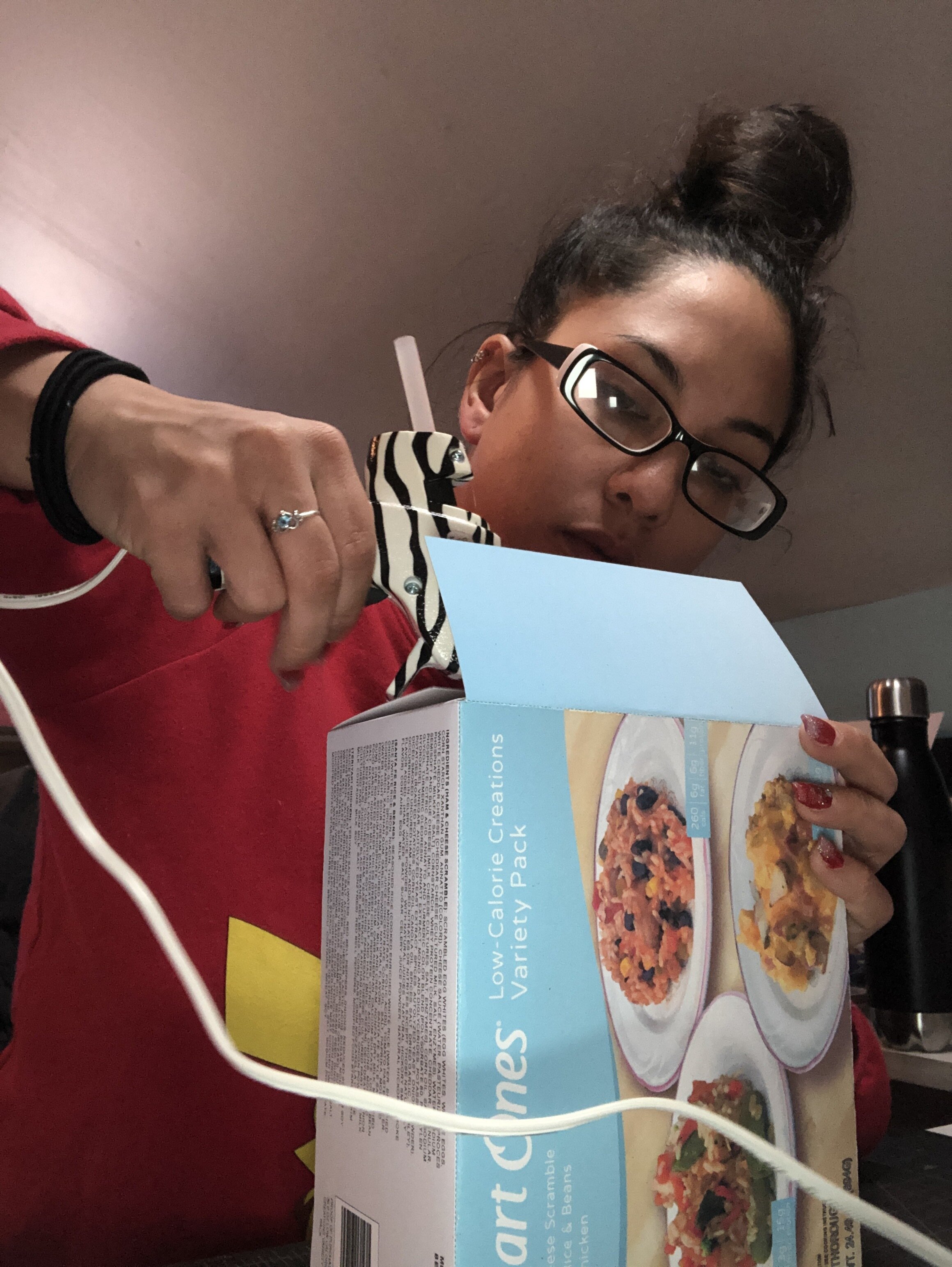
Feeling like business cards are important, I asked her, “Do you want me to whip up some quick ones for tomorrow?” She gratefully accepted and I decided that for today, this would be my design quickie. I had to raid my stash of papers and stocks to see if I had any white cardstock. Unfortunately, I only had light gray, and because I have a 6-cartridge photo printer that does not employ white ink, gray was not an option. However, I did have a pad of bristol vellum. Although it’s textured and not ideal for inkjet printing, it was the best I could do with short notice. I pulled out that pad, a cutting mat, my light tablet, my last pack of Letratac and a box of laminating sheets.

The front selections for Jojo’s business cards.

The front selections for Jojo’s business cards.

I went to work on these cards, keeping in mind what I did for her writing portfolio—she used gray, black and red. Although red can be beautiful, I felt like it would have been too strong of an accent color here, so I just went on with grays and black. When i finished a selection of three fronts and three backs, I emailed her a screenshot of her selections and let her pick. She liked “1 and 2”, so that’s what we went with.

I had her confirm her information was correct and went to work printing. The ink did just as I thought it would: it bled a little bit and the texture of the paper made the ink look spotty. It didn’t look terrible, but it didn’t look as good as it would have on a smooth, coated paper. An option I had would have been to print the faces on presentation paper, then adhere it to the bristol, laminate, then cut. However, I felt like for a quick, last-minute project, that would have been a bit extra.

Of course, my printer decided that it would not listen to my computer’s settings and print these sheets double sided, thus rendering more work for me in assembly. No worries. I printed the first set on two separate sheets, forgetting that I could just flip the sheet, re-feed it and it would be A-OK.

I took paper tape—you know, the kind you buy at Walgreens in the bandage section—and after using my overhead snake-neck lamp to put the sheets together and line them up, taped the sheets together on one end like a hinge and attempted to apply the Letratac to the back of one sheet.

I learned the hard way that my Letratac is so old, it doesn’t work as well as it would have ten years ago, brand new. Luckily, I had Tombow adhesive dots in that little pink handheld doodad and, with the help of my light tablet, applied adhesive on the backs of the cards, around the perimeters and then in the middles for reinforcement. I closed the papers onto each other, and decided it would be safer for me to hand cut these rather than use the guillotine for fear of squishing the ends.

I hand-applied the laminate to both sides of these now two-ply cards and began to cut them out by hand.

48 plus cuts later, the first dozen was done. For the second set, I decided to flip the paper this time for printing, which allowed me to have single-ply cards, and to cut down production time on them. Print, laminate, cut, done.

I’m pretty happy with how they came out for a quick 10-minute design and hour long assembly process. They’re not professional and if I had my way, I would have had a better stock of paper to choose from, as well as a printer with a heater so the bleeding would be minimal, but alas here we are. I worked with what I had, and after a few photos were sent, my classmate/friend is a happy camper and now she has 24 business cards to pass out at the fair tomorrow.
Throwback Thursday: EGD Workshop @ Penn Museum

Who remembers how University of Pennsylvania’s Museum of Archaeology and Anthropology didn’t have a cohesive signage/wayfinding system? Anyone? Just me?

It’s funny how things come full circle. When I was a junior at UArts, we were split into groups for a mandatory week-long workshop with an industry professional who volunteered to come in and show us what they do. I was in the group that worked under Virginia Gehshan of Cloud Gehshan, an EGD design firm seated right in Old City, Philadelphia.

At the time of this workshop (2010?), conception and possibly even design finalization was going on at Cloud Gehshan for new wayfinding going up at UPenn’s famed museum. Since that was the hot topic at the firm, Virginia thought that’s what we could do, also. So, she scheduled for us to take a field trip to the museum (sort of, we had to all pile in cabs or ride the subway to get to our destination—all of which we had to figure out on our own) and reconvened in the courtyard before splitting up once more. Our group opted (by majority consensus…or maybe Virginia voted for it) for cab ($8 one way per person, about 21 blocks), although I very much voted for subway (roughly $2 for one way, I think, at the time). I thought the subway would be quicker (and cheaper), we’d just have to buy tokens.

I remember my group: Marty, Leandra, John (who literally showed up once) and I think Sophie. Marty was our group leader and instructed us to take as many photos as possible. We went around and took photographs of signage (shown above, pin letters on the brick wall of the museum’s perimeter) of all types whether or not it belonged to the museum (yup, SEPTA bus route signs, too), decorations, wall patterns, murals, vinyls, floor tiles, etc. You name it, we photographed it. The idea was to get as many different ideas of any motifs or schemes we could find. The problem was, there was no correlation between the exterior and interior wayfinding and signage.

When we were done, we headed back to our studio in Terra, the building we called home as GD students, and had a group discussion about what we saw at the museum as well as what our task would be for the rest of the week. We worked for a few hours before Virginia called time and we disbanded for the day.

The next day, we congregated into the studio, segregated in our assigned groups, and worked quietly. John, the member of our group who didn’t attend the first day of the workshop, showed up so I began going over with him what we were doing to get him up to speed.

Virginia thought I was being disruptive, so she looked over and told me to stop talking, that it’s not a social hour. I looked at her, slightly embarrassed as everyone stared at me, and said, “Virginia, this is John.” She goes, “Who is John? I don’t know who he is.” She’s clearly still annoyed. I responded with, “He’s in our group and was absent yesterday. I’m catching him up.” She felt bad, I could tell, and said, “Oh, okay.” She later apologized for calling me out when I wasn’t really doing anything wrong. I told her it was fine, and we moved on.

Despite that hiccup in our work time, our group spent the day sketching and discussing colors (sheet shown below provided by Virginia!), common shapes, potential schemes and how we were going to use everything.

After that day, John never came back. We knew this would happen, so when we divvied up the work, we gave him something non-critical, despite his promise to show up daily. We pushed through without him over the next three days, and our visions came to life.

By the end of the week, we had a full package ready to present. As instructed, we pinned up our process book showcasing our thought process throughout this workshop alongside the other groups.

It was interesting to see what everyone did, especially when color palettes and other ideas were similar but used and executed very differently.

Each group got to present their signage and wayfinding package, and at the end, we all clapped and celebrated with pizza. It was the last time I saw Virginia, but not the last time I worked with Cloud Gehshan.

Three years later, I was hired by Urban Sign and worked there for five years. One of the first projects I got to see go out the door was none other than the signage designed by Cloud Gehshan for the University of Pennsylvania Museum of Archaeology and Anthropology.

So really, my experience with EGD begins when I was still in college. I never thought that’s where I’d end up, but alas, I spent the last six years immersed in signage, murals, wayfinding, ADA, interactive displays, etc. It’s an incredible field, and I’ve learned so much being in it.

Below are some of the things we finalized as part of our wayfinding package for the museum:

Extreme Gift Card Boxing

What do you do when you buy a digital gift card and only have the code to hand out?

I guess you could email it. But if it’s a gift for someone for a birthday or Christmas, you don’t want to just send an email with a cryptic, 12-character code with a generic “Happy birthday!” message sent along with it. And it’s kind of lame to print out the email or webpage with the code displayed and shove it in a card. Just seems so wrong.

If you’re a non-creative, you can buy a gift card tin and use that. Wrap it in twenty layers, add some packing popcorn, and voilà! Instant headache!

I’m not a headache-inducing kind of gal, so since I have a little bit of free time on my hands, I decided to take it a step further. I purchased a $25 Xbox gift card for my cousin’s husband for Christmas and because it was a digital gift card with “immediate delivery”, I was trying to figure out how to give it to him. Can’t just send him a screenshot—that lacks personality…but what I can do is design something for it. What about a game case?

I could buy or find a game case and design the insert and print out the code, shove it inside and call it a day. But what’s the fun in that? Why not design the whole case?

So I did. It took a little research on my part. I don’t own an Xbox and don’t plan on it any time soon. I googled a very simple term, “Xbox game case dimensions”, and what do you know? The information is right there, clear as day! So I opened up Illustrator and started working with my magic.

I didn’t go SO FAR as to look up the PMS numbers for the Xbox green, but I did find the logos I needed (Xbox, Xbox One, Dolby, Microsoft Game Studios, and the ESRB rating) and the full cover artwork of a random Halo game to use as inspiration.

I started this last night, and in the middle of working, Illustrator had a moment and gave me the rainbow spinning wheel of doom (I’m on a Mac!—no hourglass here!). I figured it just needed a sec, so I left my perch for an hour to switch laundry loads, have dinner and indulge in some iPhone gaming. When I returned, I woke up my laptop and—

It was in the same state.

Because I didn’t save any part of this design yet (I’m the worst designer in the world—I never save often…or sometimes at all until the end), I started to panic. My back hurt from sitting and I didn’t know how much longer I could work on this. I held my breath and force quit Illustrator.

Thankfully, CC versions of these programs have auto-save, so if something happens and Illy or Indy crashes, it’ll give you a recovered version of whatever you were working on when it opens all previously opened tabs. It doesn’t always give you everything you had, but some is better than none. When I opened it back up in recovery mode, everything but the ESRB images were there. Phew.

I finished it last night and went to bed. (At 8pm. I’m old, leave me alone.) I’ll say that the back cover needs a little help, but for what it is, I’m satisfied. The information at the bottom left of the back is all legitimate information I reworded for this fake Tree Simulator game I came up with. It’s a nod to all of the weird simulation games we’ve seen over the past few years or so: Goat Simulator, Bee Simulator, Untitled Goose Game, etc. What better game to play than one where all you need to do is stand there and grow and try not to get chopped or burned down?

So you’re probably asking, where does the code come in? I’m glad you asked. (If you didn’t, I’m pretending you did.) I wrote a blurb about the game. A synopsis or description, if you will. All games have them on the back, sort of like how all books have a short thing on the back that tells you about what you’re about to read.

At the end of the blurb, I note that there’s a code for a $25 gift card that can be redeemed. I also printed out the redemption instructions from Amazon to include with the box.

While I was doing this, I remembered that I needed to make another fake game box for my best friend’s husband for a game we preordered for him for Christmas. Amazon promises I’ll have it by Saturday (Dec. 21), but in the event I don’t, I grabbed what artwork I could find from stock images or leaks of the game case and quickly put together another box for a different system.

Again, I Googled “PS4 game case dimensions” and ta-da! There it is! I went ahead and made my template and added in the elements—front cover artwork (official), back cover artwork (official), the PS4 logo and then I had to fudge the spine. I couldn’t find any good spine shots, so I went off what I know about the KH series and their past covers and went from there. I also used a basic font, Arial, because some of the spines of past games had really generic copy for the title. The logos (Disney, Keyblade and Square Enix) I had to ask the internet for. (Shout out to Brands of the World!)

Once both of these bad boys were done, I had to print and assemble. Thankfully, these guys are small enough to fit on a 13” x 19” (Super B/A3) sheet each, so I only needed to cut two sheets from one large one.

The universe is on my side today because the paper didn’t jam and I only had to re-print once! (The copy on the Xbox game was too thin and got eaten by the bleeding black ink in the fibrous paper.)

Paper engineering is a fun thing to do. I love origami and package design, so doing something like this is no big deal. Within a half an hour, I had these two boxes assembled.

And yes, that is Chris Hansen in the back. To Catch a Predator is one of my all time favorite TV shows, but what I’m watching while working is his YouTube series, Have a Seat with Chris Hansen.

I digress.

With a quick flick of the eyes, you’ll never know these are fake. But anybody who plays a game or two in their lives will know immediately they’re falsies. In fact, because they lack sheen, we can’t even disguise them as prop or dummy boxes at the store. But today, for this holiday, they are dummy boxes for gifts.

So to the two men in my life receiving these falsies, Merry Christmas and happy gaming!

The Smart Ones: Our 14-Week Journey to Build a New Marketing Plan for a Kraft Heinz Brand

Class: MKTG 5001 - Marketing Management & Strategy
Lecturer: Dennis Paris
Prompt: Choose a large, publicly-traded company with a marketing problem that’s being covered in the media.
Company/Brand: Kraft Heinz - Smart Ones

EDIT: 9/1/20 - Fox School of Business @ Temple University connected with the Smart Ones branding team at Kraft Heinz, collected information from our professor, Dennis Paris, and a few of my group-mates to publish this write-up on the project.


[NOTE: if you don’t want to read the whole story, scroll down to the phase implementation section.]

Fifteen weeks ago, I waltzed into a classroom, sat down in the front row by the window, and waited. As people walked in, I realized I knew no one’s name except for Amanda, a girl I met at orientation who took a seat in the row behind me, Jordan (we endearingly call her “Jojo”) whom I paired up with in our Monday advertising class for an interviewing exercise, Alyssa, who sat behind me in the aforementioned Monday class, and the other Alyssa whose sharp-as-a-knife eyeliner I complimented at orientation. Oh, and the professor—Dennis.

I had met most of the other people in class at orientation or our advertising class as well, but could not remember their names. I was happy to see that our class had three men—the program most of us were in only had one man, Gary, and he sat directly behind me. Clearly, this class was a mixed box of crayons.

The groans from this mixed box of crayons was comical—it was as if we had never left undergrad. We had homework due that day—by 6pm, our class’ start time. The homework was simple, though (once we understood what exactly Dennis was asking for): choose a publicly-traded company with a marketing problem that’s being covered in the media. Take that company and write a two-page, double spaced paper on who they are and what their problem is.

When Dennis came in, he gave his intro monologue, warned us about his excessive talking and then recited the prompt. He then asked us to break ourselves up into groups of five. Jojo, Alyssa and I spun around in our chairs, looked at each other, then at Amanda and Gary and almost in unison, said “Hi, group!” We laughed at ourselves and reminded each other of our names. We created a group text thread and called it Marketing Project Group, which later was changed to The Smart Ones. Little did we know we’d become lifelong friends during this adventure.

The groups were then numbered (we were 1) and asked to go up to the board closest to us and write our team number with the list of companies we researched.

Every group in the room had at least one person research Uber except ours. We had Nintendo, L Brands, Ford, Fitbit and Kraft Heinz. Dennis walked to each list and crossed out ones he didn’t want to see, as they’ve been done several times in other projects. When he was done crossing things out, we were left with Fitbit, Kraft Heinz and L Brands.

After giving our personal speeches within our groups as to why we chose what we chose (minus Nintendo and Ford), we chose Kraft Heinz. We felt that their marketing issue would be an easy one to address and work with since both Kraft and Heinz were two insanely huge household names.

Boy were we wrong.

As a company, Kraft Heinz is considered a house of brands — that is it’s an umbrella with a massive portfolio of sub-brands underneath. Throughout the first few weeks of the semester, we ran into hurdles with such a massive brand while trying to complete both individual and team assignments directly related to our project. Eventually, through the suggestion of our professor, we narrowed it down to one of Kraft Heinz’s sub-brands: Smart Ones.

Why Smart Ones? Well, Kraft Heinz’s portfolio of brands includes very little variety and quantity when it comes to health(ier) food options. In all of our research, most analysts and reporters pointed at the fact that Kraft Heinz is not keeping up with competition or trends and is neglecting to advertise or take advantage of opportunities that will most likely keep Kraft Heinz up near the top. Instead, they continue to try and perfect their flagship ketchup and macaroni and cheese products. Our quantitative and qualitative results had consumers complaining that frozen meals taste horrible, are loaded with sodium and aren’t worth the money. Our goal was to prove those ideas wrong through specific strategic implications.

Cover page for our midterm report.

For our midterm, we were told that Word (.doc) is the format of choice. So, we grabbed all of our results, extracted the data and insights we needed, peppered in some research findings from secondary sources and gave our presentation. You can read and SEE it here.

We scored a 98/100 on it, losing a point for having too many primary segments (oops!) and another for not visually connecting our implementations to our research (basically, we didn’t have enough charts/graphs/maps). However, Dennis was quite impressed with the visual presentation of our report, citing that it’s very professional and easy to look at!

The cover page is the cherry on top. The idea was to make it look like the current Smart Ones boxes, with little things changed to include important information like our names, the course info and the number of results our initial survey gathered (670 complete responses). We made sure to add the Kraft Heinz logo at the bottom to remind everyone who our original company was.

Soon after the midterm was over, though, we needed to reconvene and begin working on the final. Sounds crazy, but when you only have seven weeks to create a full marketing plan complete with projections and forecasts, you make sure you use every bit of it!

In those seven weeks, magic happened. Of course, we needed some help from our friends, Caffeine and Determination, but we were able to do it. We also helped each other get through everything—tears, sweat, swearing, thoughts of dropping out. It was like a really corny graduate school telenovela.

We conducted another survey to see what people would think about our strategic implementations. We didn’t push as hard this time, so we only pulled in a fraction of the responses as last time, but we still exceeded the minimum and had a lot of good data to go through. We found what people liked and didn’t and what they expect from the things they buy. We also got insight on which of our ideas people would be interested in, and from that we began building the structure for our implementations.

But something stuck in my head from the midterm. Dennis wanted visual connections. Even though I know he meant more perceptual maps, bar graphs, pie charts, wire graphs, etc. I wanted to take it a step further. As a graphic designer, I needed to use my skill and make this the best project I could for my team. Of course, the main way to do that is to, you know, actually do the work and get the meat onto the bones. But what’s a dog without its fur? Or, in this case, a frozen meal without its box?

Visual. A word that stuck with me that whole second half of the semester. In our notes, we wrote “More perceptual maps”. I was leaving that to Gary—he seemed to like making them. But I suggested we design the box we’re talking about. This way, we can not only talk about the re-categorization of the meals, but we can show it. People will better understand the concept with things they can see that are being described aloud or in the reading.

It didn’t stop at boxes. I designed coupons for our on-the-box promotions and handouts during the in-store sampling events we proposed. Posters were designed, window clings were produced and we even thought about printing the cooking instructions on the plastic film for the variety packs people would love. No box? No problem! Thankfully, I was able to make this happen while chipping in ideas for my group mates to mull over and enhance with their own. We were a force to be reckoned with in this project and we knew it.

Each category of frozen meal was granted their own identity using colors and imagery. Smart Ones was already doing that, but using cuisine as their model. Truth is—no one cares that the meal is Italian-inspired. They care if it’s good for you and tastes good—something our new boxes would help identify.

IMG_6608.JPG

Between all of our texts, group calls and individual working time, my guess is that we spent no less than 80 hours on this project on the second half of the semester. It sounds crazy, but here’s a little math to back that up: each of our calls together were no less than three to four hours. We had no less than two of these calls a week and no more than three. That means we spent anywhere between six and twelve hours each week working on it. Multiply that by seven and you get 42 to 84 hours put in. But remember— this doesn’t include our group texts and individual working time.

By myself, I probably put in no less than 50 hours (and $150 in ink and other supplies) to design, finalize, print, and assemble these prototypes, as well as do my portion of the research, paper, Powerpoint and help any of my group-mates with whatever they needed. This was an important project (not just because it was for school), but because we wanted to continue to blow it out of the water.

We were—we are—very proud of the final products—the report included. Dennis and his academic pal, Sean (from Housing—long story), quite enjoyed our display and honestly? So did we. There was an attempt (a nice one, too, thank you Dennis!) to get someone, anyone, from Kraft Heinz to come to our presentation. However, they declined to respond to Dennis’ emails and he jokingly told us they were one email away from filing a formal complaint with the university. (Please don’t.) I guess they were too busy counting their new ketchup packets and tasting their Mac and Cheese sauce to be bothered.

All of our hard work and long hours paid off: we presented without a hitch (well, we sped through the presentation because we only had 15 minutes for 21 slides) and people loved our physical elements! (Well, some people in the class looked annoyed with us, too, but that’s OK.) The next day we received our grades - 91% for the written report and 100% for the presentation. We felt great—a weight off of our shoulders and pride beaming through us all.

If you’d like to take a look at our final report, click here. If you want to browse our Powerpoint presentation, click here. Below I’ll go through the phases of implementation, the meat of the presentation! Portions of the paper for each section will be included. Each photo below can be enlarged for viewing pleasure and will appear in a lightbox format.

The cover slide of our presentation is projected onto the screen.

The cover slide of our presentation is projected onto the screen.

Phases of Implementation

Phase 1: On-the-box Coupons

The first part of our brand re-design is an event that leads up to the launch of what we call the “Smarter Box campaign”. In this initial campaign, coupons will be placed on current Smart Ones boxes, allowing customers to save money on the meals. Each coupon will also serve as a counter for us to see which meals do best and which meals may need improvisation or discontinuation in the future. Each coupon placed will be of a specific color that relates to that meal’s new categorization as mentioned above.

The coupon that will appear on current Smart Ones boxes to kick off the Smarter campaign.

Leading up to the launch of the Smarter Box campaign, coupons will be placed on current Smart Ones boxes. These coupons will begin in July 2020 and continue through November.

Our initial run of 50 cent coupons will be 40,000 units, totaling ls 10,000 coupons for each of our 4 future product lines. We will launch these coupons at 50 Acme, Weis and ShopRite stores in the Philadelphia Metropolitan Area. Each store will receive 800 coupons over the course of the July-November timeframe. Based on sales figures after the first 3 months of the tactic, we can evaluate if we need to supply more coupons to our retailers and make necessary adjustments to inventory for the Smarter Box launch set for January 2021.

Smart Ones single-serving and variety pack boxes

Phase 2: Smarter Box & Variety Pack Launch

With the Smarter Box launch, customers will see redesigned packaging for the meals, straying far away from the traditional red swoop at the top to a box that fully embraces a color chosen for each new categorization. The current categories, divided by cuisine, are as follows: American (blue), Italian (green), Mexican (orange, and Asian (purple). Our proposed divisions are: Low-Calorie Creations (light blue), Vegetarian Delights (green), Protein Packers (golden-yellow), and Healthy Hearts (red). By following this new grouping, we open the door for not only Smart Ones, but Kraft Heinz, to rethink their offerings and give them a chance to hop on the health trend bandwagon.

An idea we had that doesn’t seem to exist with Smart Ones, let alone the key competitors we researched (Healthy Choice, Lean Cuisine, and Amy’s), is variety packs. Not to be confused with multipacks, which do exist in small quantities in very few retail spaces, variety packs, first offered in three-meal boxes, will make it easier for consumers to try different varieties of Smart Ones meals while still keeping within budget. Smart Ones meals are lower on the pricing scale, beating out its competitors in product cost across the board at most points of sale.

Included in the variety boxes are trays that have the cooking instructions printed on the film, keeping in mind that boxes may be larger than usual to fit in the freezers, so purchasers may remove them for a better fit and/or to bring to work/school/wherever for easy transport.

Cooking instructions are printed on the tray film

Should the variety packs prove to be successful (qualitative research we conducted showed people would be interested in buying variety packs), there will be launches of new ones that may mix categories to create a specific flavor profile (“Smarter Day”) and include five meals (“Smarter Week”) rather than three.

Starting in December 2020, in accordance with the holiday season and the New Year, we will launch the Smarter Box campaign. We will initially launch the rebrand in all 50 grocery stores we previously offered coupons in during Phase 1 of the campaign, and in 25 Target and 25 Walmart stores in the Philadelphia Area.

Also In December, each store carrying the new Smart Ones boxes will receive signage and promotional items to accompany the new product look, these include freezer clings, highlighting the new product packaging.

All 100 stores will receive an inventory of Smarter Boxes based on the sales of products sold in the preliminary coupon campaign. The launch of the campaign will be measured and monitored during the December-February launch campaign, through coupon tracking validation and sampling booth coupons.

Phase 3: In-Store Sampling

The last stretch of our local test market launch is to indulge in some in-store sampling. Tables will be set up in select stores during 18 weekend days over three months to promote the brand in all its colorful glory. Our research showed that the negative perception of frozen meals in general is that they taste horrible (in addition to being bad for you). By offering samples, we hope to change consumers’ minds on the flavor as well as give them an opportunity to see what Smart Ones now offers.

In addition to a free snack, store patrons will be given a coupon that’s good for $0.50 ($1.00 for variety packs) off any variety of a Smart Ones frozen meal in the category that was sampled that day. For example, if a Heart Healthy meal option was sampled, the coupons that day will be valid for savings on a Heart Healthy meal.

At the tables, with the coupons, will be posters (see below) designed specifically to match the box in color with witty sayings to capture attention and to allow people to begin making correlations.

Our final market test phase is in-store sampling of Smart Ones healthy alternatives. The goal of this phase is to engage customers, gain customer loyalty, and eliminate the stereotype in customers’ minds of the product tasting unpleasant. We hope that the in-person customer engagement will build rapport with our target audience and educate them on the products we offer and their ingredients, especially our new healthy product line.

This tactic is easily replicated for seasonal promotions after the launch of the initial Smarter Box New Year campaign. For example, during back-to-school season, promotional coupons and messaging can be focused on busy school schedules and dinner planning.

These sampling booths will be highly branded based on which meals the sampler is serving. We will create posters, accompanying collateral for each line of Smart Ones sampled, so that each interaction at our sampling booths are in line with the Smarter Box campaign.

Parallel to the aforementioned events, the manufacturer’s coupons will be run and distributed by the demonstrators at the sampling tables. Each set of coupons correlate with the proposed meal categories and will be good for those specific categories, allowing us to obtain a victory with this tactic. The coupons will also allow us to track sales that are directly influenced by the sampling event.

Phase 4: Nationwide Launch

When the GPA (Greater Philadelphia Area) test launch proves to be successful, Smart Ones will then prepare to go into a full, nationwide launch of the rebrand.

Upon success of the previous phases in the Philadelphia area, we will commence phase 4, a nationwide launch of the Smarter Box and variety pack campaign. The same processes used in phases 1–3 will be employed, essentially rolling out the rebrand. The goal for this final phase is to have a net worth of $50 million in sales (annual) and a stronger brand awareness for Smart Ones’. This will hopefully encourage Kraft Heinz to keep up with the competition.

The goal of $50 million annually was inspired by Lean Cuisine and how they, through a package redesign and successful campaigning, were able to pull in $58 million in one year. That article can be read here. Though $58 million would be better, we understand that because Smart Ones sits so low on the chain right now, aiming too high might be foolish and unattainable. Our primary goal is to create brand awareness, encourage customers to engage with the brand through trial and savings and let the product do the rest of the work.

Eventually, there will be other forms of advertisement, such as commercials and web ads (below) that bring users to a redesigned Eat Your Best website that focuses mainly on Smart Ones (but will not drop SmartMade or Indulgence from its lineup) where they can download a coupon for mobile display or printing.

Ad placed on FoodNetwork.com

Strategically placed ad on AllRecipes.com—good for those who give up on finding a recipe or think they’re too complicated. (Convenience.)

Ad placed on YouTube, visible when users watch videos related to food or lifestyle. (Shown: Grace Booth//Grackle, UK YouTuber)

All in all, although this semester with the project was trying, and sleep was a much appreciated treat when it was all over, it was very rewarding. Not only did all of us do well on the project and in the class, but we all bonded, became close and still talk without skipping a beat despite the class being over for one whole week already. In fact, we’re discussing what our group thread should be for next semester, as we’re all in the same two classes. The hope is that we get to work together again in some capacity; though if we don’t, at least we know we have each other to rant, rave and get opinions. Oh, and to go out and get fries from European Republic and sit outside of the Museum of the American Revolution after class at 10pm, eating said fries and shooting the wind.

Jokingly, we talk about opening a marketing agency together. Who knows—maybe it’ll be an integral part in my business partner’s and my plan in the future.

I do need to say something about Dennis in this post. Although there were times where we didn’t agree with Dennis in his practice or ideas, we all came to a consensus that he’s a great guy, full of opinions, assistance and nothing but best wishes for his students. He knows the work is hard, but he expects the class to work harder—which is what we tried to do. So Dennis, if you happen to be reading this, and made it this far, thank you.

P.S. They’re not quizzes. They’re tests. (lol) •